Question we wanted answering.
1. Should we
use the dark grey bookrum for all our packaging? the brief says that
exterior packaging should be black however we feel, for visual
consistency, and just looking better, that we prefer the grey.
2. Would a spiral bind ruin the sample book?
3. Should anything accompany the coasters? Information or logo?
4. Do you think this would be an effective way of communicating to designers?
5. Does it give you the right information and would the spreads in the book benefit from photographs or imagery?
Eddie & Mitch
Strengths
-Strongest
outcome of the brief is the book, because as a product it would contain
Fedrigoni paper in a more modern and contemporary way effectively
reaching the target audience.
Areas For Improvement
-Screen print Fedrigoni on the book cover
-Promotional material for the book - how are you going to promote it towards your audience?
Packaging
- Grey scale doesn't really follow the colour scheme.
- Needs more to recognise the brand from.
- More innovative, unique packaging other than a box to follow the style the book has been produced.
Considerations/questions
- Grey works well , kind of blends in from the blues, also black would drown out the colours, the grey more subtle.
-
Don't spiral bind, would lose all quality. Make it look cheap - like a
sketchbook. Perfect bind it or re-print the book considering a gap for
an Asian bind.
- Set up a screen to screen print the brand onto
the book cover and print onto the coasters aswell. Maybe incorporate the
ladder thing (logo) into the coasters like on the book covers. Back
page job again.
- The way the book is designed is by designers for designers so the overall product itself communicates perfectly.
- Info is fine, having the actual stock to touch and feel is way better than including photographs.
Chris, Liam & Sam
Strengths
- Visually appealing - uses all senses - Touch etc.
Areas for improvement
- Don't do yellow coaster
Considerations.
- Grey is shade of black - but looks better.
-
Spiral bind? NO! would ruin the appearance - perhaps get a spine and
stitch it. If you went for a spiral bind you may need big page sides.
- Perhaps some small white type ... info on paper ...etc
Make stand out, but not essential
- So will appeal to designers - appeals to all the senses.
- would not benefit from imagery ... high enough quality not to need it, your selling paper.
A
really useful crit with some feedback that has tackled some issues we
may not have picked up on. Has also helped to answer some questions from
different perspectives other than our own as we may have been inclined
to use black packaging to fit with the brief but we much prefer the grey
and know that others also do.

3.30.2012
3.29.2012
3.28.2012
3.27.2012
3.25.2012
Fedrigoni Progress crit
In the session we were critted by peers on the concepts we'd developed
over the last week on the brief. We were asked to write 3 questions that
our peers would base their feedback upon.
These questions were :
- Is a mail out the most effective way to communicate with the target audience?
- Would receiving something like what we've suggested inspire you? or would you just throw it away?
- Would a mass advertising scheme help in the promotion of this product to designers?
Sadie & Baljeet.
PROBLEM ANALYSIS
- Have really understood the underlying problem > considered the underlying problem within the brief aswell as the problems in the actual brand
CONCEPTUAL DEVELOPMENT
-Initial ideas have been thought out, and answer the underlying problem.
DESIGN PROPOSAL
- Well considered solutions that push the given brief.
Additional comments
- Look at how you can encourage people to work with colour to make the range more desirable.
Marty & Steph
PROBLEM ANALYSIS
- Identification of problem, swatch book unclear, as is new promotional material.
CONCEPTUAL DEVELOPMENT
- Paper engineering - a promotion of paper craft - interesting sample book.
DESIGN PROPOSAL
- Aware of Fedrigonis gaps and ways they could possibly approach them
- Gradated.
Additional comments
- Make the swatch book interactive? Foldable, flick book, construct.
- Think of ways to expand on Fedrigonis limited colour palette in approach to packaging.
- Economic pack?
Luxury?
Professional?
Papers suitable for what purposes?
- Why aren't designers finding a need for coloured paper?
3.24.2012
Fedrigoni concept crit - YCN
Given by:
Chris van & Ben Harwood.
Content / subject
Strengths
- problem analysed perfectly
- Analyse problems in brief aswell.
Media / distribution
Strengths
- Recognise way to send out information and that you need to leave an impression on the person receiving it.
Considerations
- wow factor
- Interactor
- Building the companies reputation.
Audience / context
Strengths
- Narrowed down the specific audience
Considerations
- How do you communicate to creatives?
Product / deliverables
Strengths
- Recognised audience for products.
Considerations
- Mailshots.
Given by:
Niall Cruickshank-Sutton & Frankie Roberts.
Content / subject
Strengths
- Highlighted the problem
Considerations
- What are you promoting?
- How will you get Fedrigoni known?
Media / distribution
Considerations
- How will you get the Fedrigoni name known? what media?
Audience / context
Strengths
- Understanding who the audience are
Considerations
- How will you contact them?
Product / deliverables
Considerations
- What will you produce?
- How will you contact?
3.21.2012
YCN Collaboration contract
Brief title.
- YCN Competition Brief
Why have you chosen to work with your creative partner? what are your aims?
I chose to work with Matt because I felt that my skill set complemented, if not matched, the skills that he outlined for his creative partner. I was also drawn to the design of his sheets and felt that his image base and skills with software and colour would prove beneficial overall.
What are your specific areas of creative interest in this brief?
I'd very much like to go back to working with print, and although not massively in favour of a packaging brief, I'm open to the possibilities that arise from this collaboration and don't want to disregard an opportunity. I also see this as a good opportunity to learn from my partner, especially in terms of colour, because I think Matts grasp is much better than mine.
What specific design skills do you have to offer in relation to your collaboration? How do you intend to use them?
I feel as a designer I am based very much around type & layout and also the physicality of print. So I think I could bring typographic knowledge and a meticulous approach towards the outcome to the creative table... I am very interested in printed finish, in terms of stock and special print so I think this could also be useful in the collaboration.
What non-specific skills do you offer in relation to your collaboration? How do you intend to use them?
In terms of non specific skills, I think i can bring meticulous attention to detail and the process of producing work. Also along with this comes a hatred of spelling and grammatical errors so proofing etc is not a problem, which I think will be particularly useful in this collaboration. Also over the past few months I've become much more organised and feel an improved work ethic and use of time management will benefit the collaboration.
What will your specific roles be in the collaboration?
I think within the collaboration I'd take a slightly more organisational role as well as print based designer, working off screen in terms of print finish.
What will your individual responsibilities be in relation to your collaboration?
- As mentioned previously, I'd like to go back to working with print so designing with this in mind would be one of my key responsibilities.
- I would probably focus on typographic elements of the designs, working very much with the skills learnt in the type module.
- Attention to detail.
What will our joint responsibilities be?
Joint responsibilities will probably be building of concept and a share in the overall design duties.
3.07.2012
3.06.2012
Enterprise - Craft - Business Plan
Document laid out by Joe using everyone's collected work in the format of a business plan.
Revised business plan.
Revised business plan.
This is a revised business plan with additional information with regards to finance and accounts.
Enterprise - Craft - Paper portfolio photos

The portfolio and business card together in a plastic wallet.

The two separate elements
Portfolio cover detail.
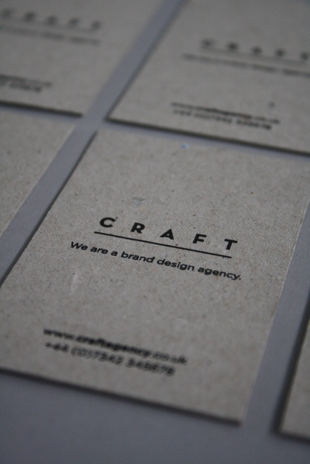
Business card detail.


Paper portfolio spreads.

Back cover.
Enterprise - Craft - paper portfolio
The paper portfolio handout that we created for the enterprise presentations as a promotional/informational device for our business, Craft.
3.02.2012
Rob Van Hoesel
A designer based in the Netherlands that I came across whilst browsing a creative blog. Really like the work he produces, someone I'd be very interested in contacting despite being based in the Netherlands.
Publication
Spaces and Places in between
Publication, poster and CD


 A music based publication produced as a pack with a CD and trace printed poster. Really like the format used for the presentation of this publication and the use of type. Using the poster as a form of packaging, keeping the booklet and CD together is really interesting and the way the design on the trace interacts with the design beneath it on the cover of the book creates a really interesting aesthetic. The publication contains some really simple layouts with only a few hundred words and an image but it seems to work really well.
Identity
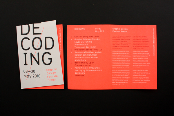
Graphic Design Festival, Breda
Identity, catalogue and event promo


 Identity and catalogue for a graphic design festival in the Netherlands. Really strong yet incredibly simple visual mark, with an aesthetic running across all media. Love the use of the fold for the cover of the publications conextualising the mark and creating an interesting difference throughout the entire identity.
Dieuwertje Komen
Identity


Really simple identity for a photographer using a shape based around the negatives and visualisation of the photographers work. Again really simple but effective, colours used to give a slightly more feminine feel to the overall identity due to the photographer being female.
Publication
Spaces and Places in between
Publication, poster and CD


Identity
Graphic Design Festival, Breda
Identity, catalogue and event promo


Dieuwertje Komen
Identity


Really simple identity for a photographer using a shape based around the negatives and visualisation of the photographers work. Again really simple but effective, colours used to give a slightly more feminine feel to the overall identity due to the photographer being female.
Enterprise - Craft - The presentation.
Slides from the final presentation that Charlotte and Luke expertly delivered while Joe and I cowered in the corner and handed out paper portfolios. The design of the slides was done as a group as they came about from the culmination of every ones separate efforts into researching the business.
Enterprise - Craft - Catalogue.
Catalogue
Catalogue is an independent graphic design studio based in the North of England. The studio was founded in 2010 by Tom Pratt and Oliver Shaw. The studio specialises in design for print, branding, identity, books, exhibition and web. We work for both commercial clients and on self initiated projects.

Strengths
- Focus on client relationships and return business
- In house printing facilities.
Weaknesses
- Niche market with graphic style.
Opportunities
- Small practice, possibility for collaboration
Threats
- Printing facilities mean they don't always have to out source printing, can offer work for cheap!
Enterprise - Craft - Presentation script.
The script written for the presentation predominantly by Luke and Charlotte, as they were presenting, with input from Joe and I regarding finance and competitors.
3.01.2012
Enterprise - Craft - paper portfolio ideas.
What if Pine
Heydays


Heydays


Really nice presentation just like a newspaper, this is very similar to what we're going for as it is simply a piece designed to look like a newspaper that showcases the work of a designer. Really simple layouts with images nicely complementing the spreads.
Portfolio '11 Newspaper
Marianne Riegelnegg


This is another paper portfolio, this one however is much more like a mail out to specific agencies, like a CV. It is still a similar principle, using the newspaper format to showcase work.
The Informer Newspaper
Gary Nicholson


A newspaper designed in a rather interesting fashion, making use of a limited colour palette but applied fairly liberally. Not that much of a fan of the general layouts in this publication however I find the front cover really interesting as it's really simple compared to a lot of the more complicated spreads and still works really effectively.
Enterpirse - Craft - description
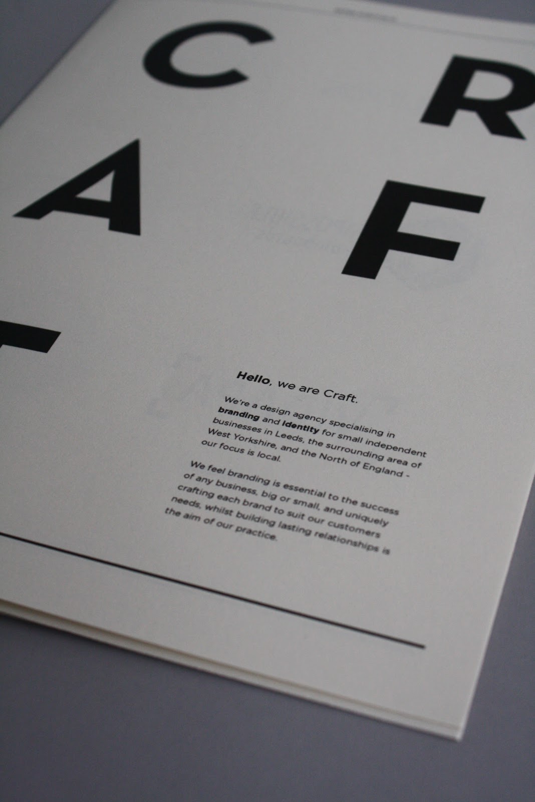
Hello, we are Craft.
We’re a design agency specialising in branding and identity for small independent businesses in Leeds, the surrounding area of West Yorkshire, and the North of England - our focus is local. We feel branding is essential to the success of any business, big or small, and uniquely crafting each brand to suit our customers needs, whilst building lasting relationships is the aim of our practice.
We’re a design agency specialising in branding and identity for small independent businesses in Leeds, the surrounding area of West Yorkshire, and the North of England - our focus is local. We feel branding is essential to the success of any business, big or small, and uniquely crafting each brand to suit our customers needs, whilst building lasting relationships is the aim of our practice.
Enterprise - Craft - daily charge rates.
Nice one Joe!
We calculated our overheads based on standard expenditure costs
including rent (at £399/month at Duke Studios); software - Adobe
Creative Suite, MS Office and various studio equipment, travel and
research costs and so on.
Based on an initial £25,000 salary for year 1 (£17,127 after national
insurance and income tax), our annual income required is £100,000
alongside the total overhead costs of £17609.05. Using these values, and
based on 244 available work days, our minimum daily charge rate as
'Craft' is £482.
As we intend to make a profit in the first year to account for various
contingency costs (including small business loans and dividends), our
actual daily charge rate is £600. This will provide an annual pre-tax
profit of £28,792 and a total net profit of £23,033.60. However, the
amount we can charge can be anything above £482.


Enterprise - Craft - SWOTing possible competitors.
Moors Creative
www.moorscreative.com
Big Enough to Deliver, Small Enough to Care
Moors Creative is a full service design agency with over ten years' experience.
We offer a comprehensive design service which includes print, website build & hosting, signage, corporate identity/branding and literature.
If you are looking for a large scale re-brand or just a simple flyer, we can deliver a creative solution within your budget.

Communicate with Focus & Clarity
Branding We believe that Creating a brand is not simply about putting a logo on a business card, it's about creating identity and how that identity transfers across all media.
From start to finish, we can help you to gain recognition and build your identity with the support of a strong brand, including logo design, literature, signage and much more.
People are not looking for you, so make yourself stand out.
Strengths
- Providing marketing literature & advice.
- All encompassing solutions // full visual identities.
Weaknesses
-No discernible USP.
Opportunities
-We are a small practice and may be able to under cut them on price.
Threats
-They have the ability to use their current reputation to take business from us.
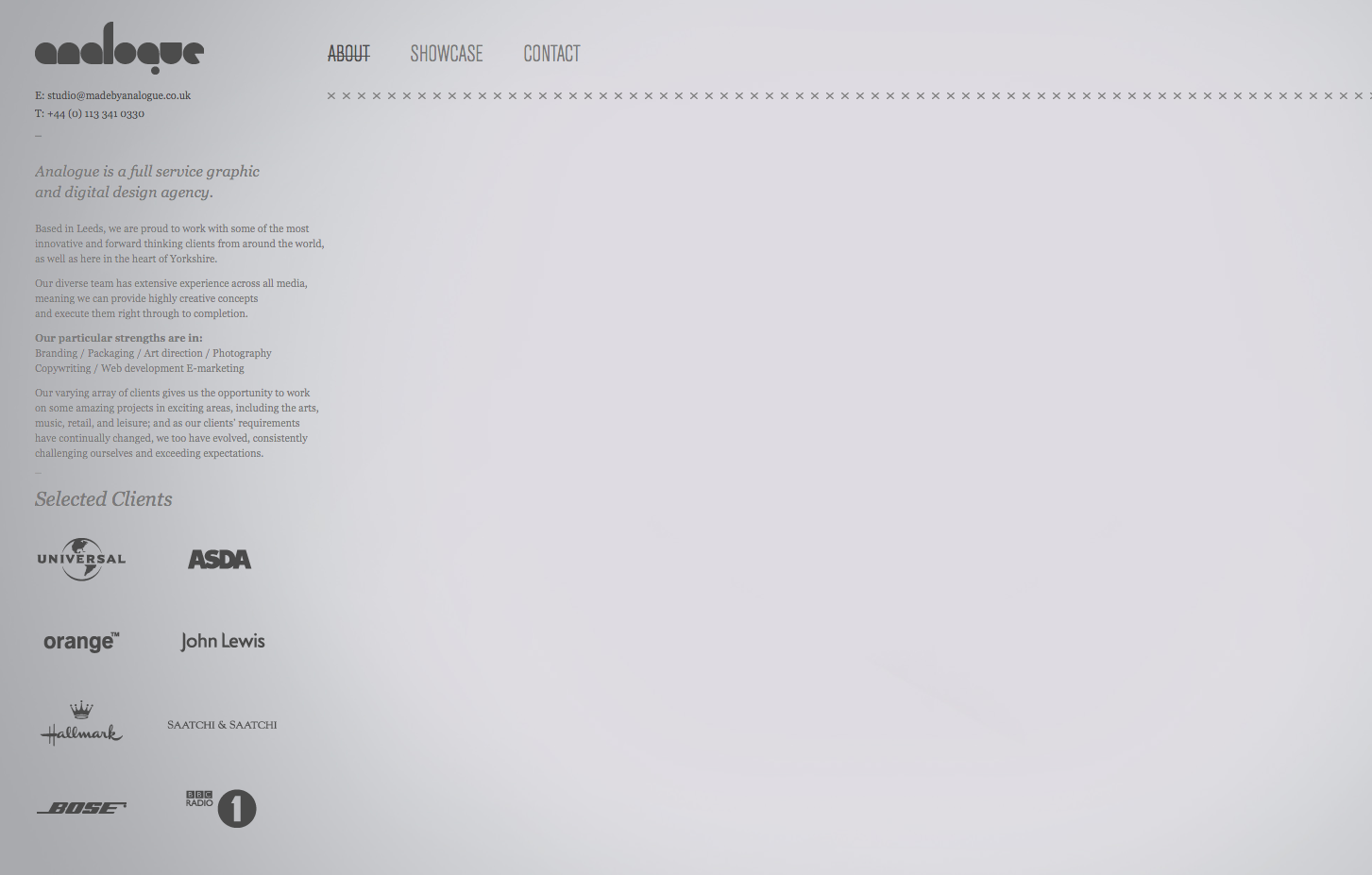
Analogue
www.madebyanalogue.co.uk
Analogue is a full service graphic and digital design agency.
Based in Leeds, we are proud to work with some of the most innovative and forward thinking clients from around the world, as well as here in the heart of Yorkshire.
Our diverse team has extensive experience across all media, meaning we can provide highly creative concepts and execute them right through to completion.
Our particular strengths are in : Branding / Packaging / Art direction / Photography / Copywriting / Web development / E-marketing
Our varying array of clients gives us the opportunity to work on some amazing projects in exciting areas, including the arts, music, retail, and leisure; and as our clients’ requirements have continually changed, we too have evolved, consistently challenging ourselves and exceeding expectations.

Strengths
- Team working across all media. digital illustration, type etc.
- Small practice, happy to accept smaller clients.
Weaknesses
- Fairly niche aesthetic, couldn't be applied to some businesses.
Opportunities
- Opportunity for collaboration due to their location and the size of their practice.
Threats
- Similar size practice also gives them the ability to take business from us.
Fuse8
www.fuse8.com
fuse8 are a complete creative and marketing services agency that just happens to think interactive experiences are the best way for brands to get closer to customers.
We combine a wealth of technical knowledge with an understanding of what customers really want from companies to create powerful digital experiences, building audiences and communities online that deliver real rewards for our clients.
The way consumers interact with any business has changed forever. And it's not stopping.
You need to work with a team that understands exactly how.
CREATING BRAND MOMENTUM
THROUGH
REWARDING CUSTOMER EXPERIENCE
DELIVERING
RETURN ON ENGAGEMENT
In today's increasingly interactive market place, fuse8 takes theory and makes it real; delivering strategic insights, creative planning and technically innovative ideas. This will kickstart any brand that wants to get closer to its customers.
We will make your brand bigger.
We will make it move forward faster in these already fast moving times. Once we start the brand rolling, we can work with you to ensure the momentum continues.
‘Reward’ Customers
We need to create solutions that ‘reward’ customers for choosing to spend time with the brand. Rewarding for the customer; emotionally or practically. And if it’s rewarding for the customer their perception of our client as a brand that emphasises, entertains or services becomes cemented.
Experiences Engage
Exposure is no longer a relevant measure. Education is no longer enough. Experiences engage. And engaged customers are the brand (and service) advocates that your business needs to create real, valuable and long-term returns.

Strengths
- International
- Professionals from all creative fields brought together.
Weaknesses
- Corporate visual style may put smaller businesses off
Opportunities
- They leave a gap in the market that we can fill.
Threats
- They're large and have the ability to take any job.
Better Brand Agency
www.betterbrandagency.com
Design is making the mundane appear extraordinary. It’s the ability to bring order from what can be, quite often, absolute chaos. Design is many things to many different people, but there’s one thing everyone agrees on; good design is integral for business success.
Your image should be designed, crafted and carefully managed to ensure consistency in delivery.
Never veering from your brand’s sense of colour, tone of voice and visual consistency, once they’ve been set in place. These are your brand guidelines. And your brand guidelines are your bible.
Better will help you to create and sculpt your image. We’ll produce creative design, which will meet your target customer’s expectations, needs and aspirations.
Corporate Literature // Brochure Design // Packaging // Annual Reports // Promotional Goods // Exhibition Design.

Strengths
- Large client base and reputation from that.
- A number of awards to their name
- Full service.
Weaknesses
- Stokesley based - outside central business areas.
- Corporate style - not relevant to the identities of some businesses.
Opportunities
- They take up corporate jobs leaving smaller independent business to us.
Threats
- Not as intimidating as some larger corporations, so could take business from us.
The Consult
theconsult.com
The Consult is a team of brand and design experts. For the past decade we've been delivering impact-making communications for our clients and their brands.
Our insight helps to strengthen brands. Developing ideas that inspire your customers and enabling
you to build long-lasting relationships.
We realise the importance of thinking things through. Understanding your market and strategic objectives is an integral part of our design process. That way we know we're delivering creativity that works.

Strengths
- Full service - brand - marketing strategy - annual reports.
- Vast experience from all creative fields.
- Another agency who've won a number of awards adding to their reputation.
Weaknesses
-
Opportunities
- Being only a small practice there is still the opportunity for collaboration.
Threats
-They can snap up business with their reputation alone.
Elmwood
www.elmwood.com
Put simply, we help brands uncover what’s special and different about themselves and tell the world about it. There’s the thinking and words in brand strategy and brand language through to the visual magic of corporate design and packaging design. Our digital work brings all this together.
The World's most effective brand design consultancy

Strengths
- Reputation as the world's best brand design consultancy.
- International company, with studios in London, Leeds, Melbourne, Singapore and New York.
- Hundreds of awards.
Weaknesses
- Smaller businesses put off by scale and price.
Opportunities
- Smaller businesses may come to us rather than Elmwood.
Threats
- Take business across Leeds and the UK
The One Off
www.theoneoff.com
We have excellent strategists and experienced design directors. We have young eager designers too.
We have designed global identity and image guidelines for Barclays Bank and Best Buy. We have worked for the Design Council on image guidelines for web... and we have worked for our local man in a van.
We are easy to work with and will tackle the project appropriately.
We work across language, culture and sector. This may include naming, brand extension and key messages that can be used to form part of an integrated marketing campaign.
We work hard for our clients because we love what we do. We enjoy success. We believe that working collaboratively and with respect delivers better quality design work that over delivers commercial objectives.

Strengths
- A lot of projects under their belts.
- Based in London, UK business center
Weaknesses
- Huge practice with corporate style.
Opportunities
- Smaller businesses may come to us rather than them, and won't take business within Leeds.
Threats
www.moorscreative.com
Big Enough to Deliver, Small Enough to Care
Moors Creative is a full service design agency with over ten years' experience.
We offer a comprehensive design service which includes print, website build & hosting, signage, corporate identity/branding and literature.
If you are looking for a large scale re-brand or just a simple flyer, we can deliver a creative solution within your budget.

Communicate with Focus & Clarity
Branding We believe that Creating a brand is not simply about putting a logo on a business card, it's about creating identity and how that identity transfers across all media.
From start to finish, we can help you to gain recognition and build your identity with the support of a strong brand, including logo design, literature, signage and much more.
People are not looking for you, so make yourself stand out.
Strengths
- Providing marketing literature & advice.
- All encompassing solutions // full visual identities.
Weaknesses
-No discernible USP.
Opportunities
-We are a small practice and may be able to under cut them on price.
Threats
-They have the ability to use their current reputation to take business from us.
Analogue
www.madebyanalogue.co.uk
Analogue is a full service graphic and digital design agency.
Based in Leeds, we are proud to work with some of the most innovative and forward thinking clients from around the world, as well as here in the heart of Yorkshire.
Our diverse team has extensive experience across all media, meaning we can provide highly creative concepts and execute them right through to completion.
Our particular strengths are in : Branding / Packaging / Art direction / Photography / Copywriting / Web development / E-marketing
Our varying array of clients gives us the opportunity to work on some amazing projects in exciting areas, including the arts, music, retail, and leisure; and as our clients’ requirements have continually changed, we too have evolved, consistently challenging ourselves and exceeding expectations.
Strengths
- Team working across all media. digital illustration, type etc.
- Small practice, happy to accept smaller clients.
Weaknesses
- Fairly niche aesthetic, couldn't be applied to some businesses.
Opportunities
- Opportunity for collaboration due to their location and the size of their practice.
Threats
- Similar size practice also gives them the ability to take business from us.
Fuse8
www.fuse8.com
fuse8 are a complete creative and marketing services agency that just happens to think interactive experiences are the best way for brands to get closer to customers.
We combine a wealth of technical knowledge with an understanding of what customers really want from companies to create powerful digital experiences, building audiences and communities online that deliver real rewards for our clients.
The way consumers interact with any business has changed forever. And it's not stopping.
You need to work with a team that understands exactly how.
CREATING BRAND MOMENTUM
THROUGH
REWARDING CUSTOMER EXPERIENCE
DELIVERING
RETURN ON ENGAGEMENT
In today's increasingly interactive market place, fuse8 takes theory and makes it real; delivering strategic insights, creative planning and technically innovative ideas. This will kickstart any brand that wants to get closer to its customers.
We will make your brand bigger.
We will make it move forward faster in these already fast moving times. Once we start the brand rolling, we can work with you to ensure the momentum continues.
‘Reward’ Customers
We need to create solutions that ‘reward’ customers for choosing to spend time with the brand. Rewarding for the customer; emotionally or practically. And if it’s rewarding for the customer their perception of our client as a brand that emphasises, entertains or services becomes cemented.
Experiences Engage
Exposure is no longer a relevant measure. Education is no longer enough. Experiences engage. And engaged customers are the brand (and service) advocates that your business needs to create real, valuable and long-term returns.

- International
- Professionals from all creative fields brought together.
Weaknesses
- Corporate visual style may put smaller businesses off
Opportunities
- They leave a gap in the market that we can fill.
Threats
- They're large and have the ability to take any job.
Better Brand Agency
www.betterbrandagency.com
Design is making the mundane appear extraordinary. It’s the ability to bring order from what can be, quite often, absolute chaos. Design is many things to many different people, but there’s one thing everyone agrees on; good design is integral for business success.
Your image should be designed, crafted and carefully managed to ensure consistency in delivery.
Never veering from your brand’s sense of colour, tone of voice and visual consistency, once they’ve been set in place. These are your brand guidelines. And your brand guidelines are your bible.
Better will help you to create and sculpt your image. We’ll produce creative design, which will meet your target customer’s expectations, needs and aspirations.
Corporate Literature // Brochure Design // Packaging // Annual Reports // Promotional Goods // Exhibition Design.

Strengths
- Large client base and reputation from that.
- A number of awards to their name
- Full service.
Weaknesses
- Stokesley based - outside central business areas.
- Corporate style - not relevant to the identities of some businesses.
Opportunities
- They take up corporate jobs leaving smaller independent business to us.
Threats
- Not as intimidating as some larger corporations, so could take business from us.
The Consult
theconsult.com
The Consult is a team of brand and design experts. For the past decade we've been delivering impact-making communications for our clients and their brands.
Our insight helps to strengthen brands. Developing ideas that inspire your customers and enabling
you to build long-lasting relationships.
We realise the importance of thinking things through. Understanding your market and strategic objectives is an integral part of our design process. That way we know we're delivering creativity that works.

Strengths
- Full service - brand - marketing strategy - annual reports.
- Vast experience from all creative fields.
- Another agency who've won a number of awards adding to their reputation.
Weaknesses
-
Opportunities
- Being only a small practice there is still the opportunity for collaboration.
Threats
-They can snap up business with their reputation alone.
Elmwood
www.elmwood.com
Put simply, we help brands uncover what’s special and different about themselves and tell the world about it. There’s the thinking and words in brand strategy and brand language through to the visual magic of corporate design and packaging design. Our digital work brings all this together.
The World's most effective brand design consultancy

Strengths
- Reputation as the world's best brand design consultancy.
- International company, with studios in London, Leeds, Melbourne, Singapore and New York.
- Hundreds of awards.
Weaknesses
- Smaller businesses put off by scale and price.
Opportunities
- Smaller businesses may come to us rather than Elmwood.
Threats
- Take business across Leeds and the UK
The One Off
www.theoneoff.com
We have excellent strategists and experienced design directors. We have young eager designers too.
We have designed global identity and image guidelines for Barclays Bank and Best Buy. We have worked for the Design Council on image guidelines for web... and we have worked for our local man in a van.
We are easy to work with and will tackle the project appropriately.
We work across language, culture and sector. This may include naming, brand extension and key messages that can be used to form part of an integrated marketing campaign.
We work hard for our clients because we love what we do. We enjoy success. We believe that working collaboratively and with respect delivers better quality design work that over delivers commercial objectives.

Strengths
- A lot of projects under their belts.
- Based in London, UK business center
Weaknesses
- Huge practice with corporate style.
Opportunities
- Smaller businesses may come to us rather than them, and won't take business within Leeds.
Threats
Subscribe to:
Posts (Atom)